


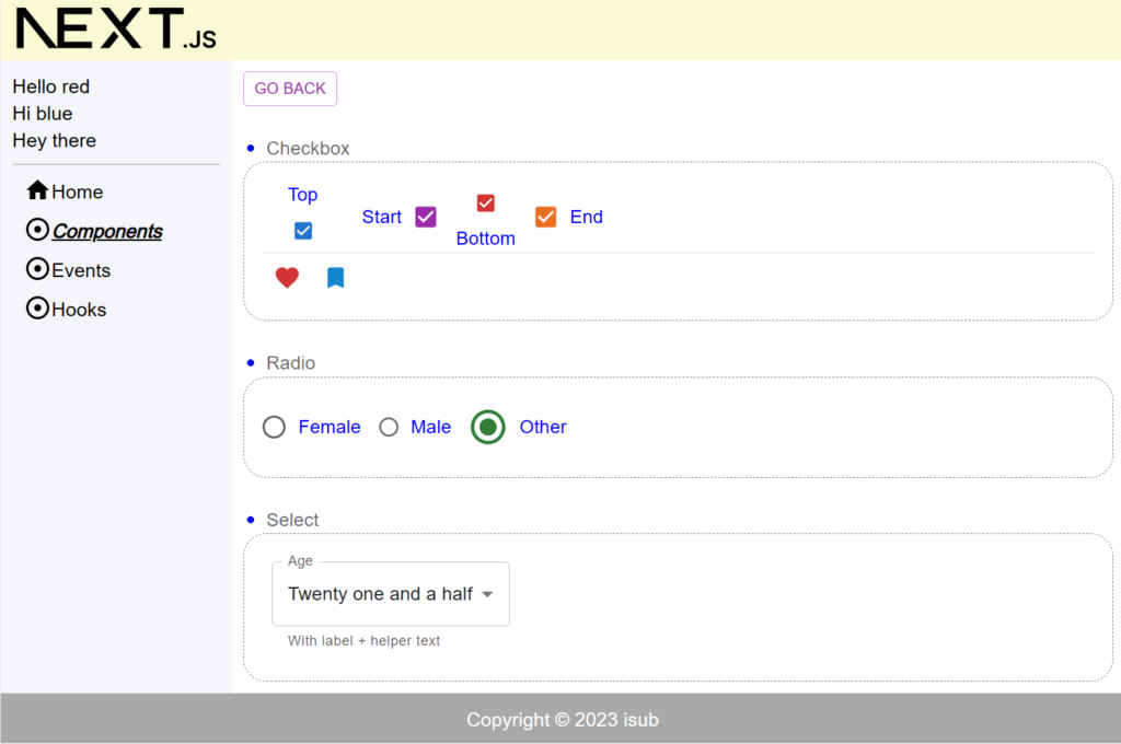
1. 概要
前回はHooksのuseReducerを使い値を更新する内容についてでした。今回はCheckbox・Radio・Select扱う内容となります。
対象としては開発を1年程やってて自分で最初から開発してみたい方になります。そのため細かい用語などの説明はしません。
2. nodeのインストール
こちらを参考
3. プロジェクトを作成
こちらを参考
4. 必要なライブラリをインストール
こちらを参考
5. ソースコード
※前回より差分のみを記載
5-1-1. src/app/components/component04/page.module.scss
.component {
  color: blue;
  & ul {
    margin-left: 20px;
    & li {
      list-style: disc;
    }
  }
}
5-1-2. src/app/components/component04/checkbox-demo.tsx
import React, { useState } from "react";
import Box from "@mui/material/Box";
import FormGroup from "@mui/material/FormGroup";
import FormControlLabel from "@mui/material/FormControlLabel";
import Checkbox from "@mui/material/Checkbox";
import FavoriteBorder from "@mui/icons-material/FavoriteBorder";
import Favorite from "@mui/icons-material/Favorite";
import BookmarkBorderIcon from "@mui/icons-material/BookmarkBorder";
import BookmarkIcon from "@mui/icons-material/Bookmark";
import { Divider } from "@mui/material";

type InputType = {
  name: string;
  value: "top" | "start" | "bottom" | "end";
  size?: "small" | "medium" | undefined;
  color?: "primary" | "secondary" | "success" | "error" | "warning";
};

const checkboxItems: InputType[] = [
  { name: "Top", value: "top", size: "small" },
  { name: "Start", value: "start", size: "medium", color: "secondary" },
  { name: "Bottom", value: "bottom", size: "small", color: "error" },
  { name: "End", value: "end", color: "warning" },
];

const CheckboxDemo = () => {
  const [checkboxes, setCheckboxes]: [string[], any] = useState([]);

  const handleCheckboxChange = (e: React.ChangeEvent<HTMLInputElement>) => {
    if (checkboxes.includes(e.target.value)) {
      setCheckboxes(
        checkboxes.filter((checkbox) => checkbox !== e.target.value)
      );
    } else {
      setCheckboxes([...checkboxes, e.target.value]);
    }
  };

  return (
    <Box
      sx={{
        width: "100%",
        p: 2,
        border: "1px dashed grey",
        borderRadius: "20px",
        "&:hover": {
          backgroundColor: "orange",
          opacity: [0.9, 0.8, 0.7],
        },
      }}
    >
      <FormGroup row>
        {checkboxItems.map((item) => {
          return (
            <FormControlLabel
              key={item.name}
              label={item.name}
              labelPlacement={item.value}
              control={
                <Checkbox
                  size={item.size}
                  color={item.color}
                  checked={checkboxes.includes(item.value)}
                  value={item.value}
                  onChange={handleCheckboxChange}
                />
              }
            />
          );
        })}
      </FormGroup>
      <Divider />
      <Checkbox
        icon={<FavoriteBorder />}
        checkedIcon={<Favorite />}
        color="error"
      />
      <Checkbox
        icon={<BookmarkBorderIcon />}
        checkedIcon={<BookmarkIcon />}
        color="info"
      />
    </Box>
  );
};

export default CheckboxDemo;
5-1-3. src/app/components/component04/radio-demo.tsx
import React, { useState } from "react";
import Box from "@mui/material/Box";
import FormControlLabel from "@mui/material/FormControlLabel";
import Radio from "@mui/material/Radio";
import RadioGroup from "@mui/material/RadioGroup";

const RadioDemo = () => {
  const [selectedValue, setSelectedValue] = useState("female");
  const handleRadioChange = (e: React.ChangeEvent<HTMLInputElement>) => {
    setSelectedValue((e.target as HTMLInputElement).value);
  };

  const radioProps = (
    value: string,
    color: "primary" | "secondary" | "success" | "error" | "warning",
    size?: "small" | "medium" | undefined
  ) => ({
    value,
    color,
    size,
    checked: selectedValue === value,
    onChange: handleRadioChange,
  });

  return (
    <Box
      sx={{
        width: "100%",
        p: 2,
        border: "1px dashed grey",
        borderRadius: "20px",
        "&:hover": {
          backgroundColor: "yellow",
          opacity: [0.9, 0.8, 0.7],
        },
      }}
    >
      <RadioGroup row>
        <FormControlLabel
          label="Female"
          control={<Radio {...radioProps("female", "warning")} />}
        />
        <FormControlLabel
          label="Male"
          control={<Radio {...radioProps("male", "error", "small")} />}
        />
        <FormControlLabel
          label="Other"
          control={
            <Radio
              {...radioProps("other", "success")}
              sx={{ "& .MuiSvgIcon-root": { fontSize: 36 } }}
            />
          }
        />
      </RadioGroup>
    </Box>
  );
};

export default RadioDemo;
5-1-4. src/app/components/component04/select-demo.tsx
import React, { useState } from "react";
import Box from "@mui/material/Box";
import InputLabel from "@mui/material/InputLabel";
import MenuItem from "@mui/material/MenuItem";
import FormHelperText from "@mui/material/FormHelperText";
import FormControl from "@mui/material/FormControl";
import Select from "@mui/material/Select";
import { SelectChangeEvent } from "@mui/material";

const SelectDemo = () => {
  const [age, setAge] = useState("");

  const handleSelectChange = (e: SelectChangeEvent) => {
    setAge(e.target.value);
  };

  return (
    <Box
      sx={{
        width: "100%",
        p: 2,
        border: "1px dashed grey",
        borderRadius: "20px",
        "&:hover": {
          backgroundColor: "cyan",
          opacity: [0.9, 0.8, 0.7],
        },
      }}
    >
      <FormControl sx={{ m: 1, minWidth: 60 }}>
        <InputLabel>Age</InputLabel>
        <Select label="Age" value={age} onChange={handleSelectChange} autoWidth>
          <MenuItem value="">
            <em>None</em>
          </MenuItem>
          <MenuItem value={10}>Ten</MenuItem>
          <MenuItem value={21}>Twenty one</MenuItem>
          <MenuItem value={22}>Twenty one and a half</MenuItem>
        </Select>
        <FormHelperText>With label + helper text</FormHelperText>
      </FormControl>
    </Box>
  );
};

export default SelectDemo;
5-1-5. src/app/components/component04/page.tsx
"use client";

import React from "react";
import { FormLabel } from "@mui/material";
import GoBack from "@/lib/components/go-back";
import scss from "./page.module.scss";
import CheckboxDemo from "./checkbox-demo";
import RadioDemo from "./radio-demo";
import SelectDemo from "./select-demo";

const Component04 = () => {
  return (
    <div className={scss.component}>
      <GoBack />
      <br />
      <br />
      <ul>
        <li>
          <FormLabel>Checkbox</FormLabel>
        </li>
      </ul>
      <CheckboxDemo />
      <br />
      <ul>
        <li>
          <FormLabel>Radio</FormLabel>
        </li>
      </ul>
      <RadioDemo />
      <br />
      <ul>
        <li>
          <FormLabel>Select</FormLabel>
        </li>
      </ul>
      <SelectDemo />
    </div>
  );
};

export default Component04;
5-1-6. src/app/components/page.tsx
"use client";

import React from "react";
import { Link } from "@mui/material";

import scss from "./page.module.scss";

const Components = () => {
  return (
    <div className={scss.components}>
      <ul>
        <li>
          <Link href="/components/component01" underline="hover">
            Component01
          </Link>
        </li>
        <li>
          <Link href="/components/component02" underline="hover">
            Component02
          </Link>
        </li>
        <li>
          <Link href="/components/component03" underline="hover">
            Component03
          </Link>
        </li>
        <li>
          <Link href="/components/component04" underline="hover">
            Component04
          </Link>
        </li>
      </ul>
    </div>
  );
};

export default Components;
6. サーバーを起動
npm run dev7. ブラウザで確認
- http://localhost:3000
8. ディレクトリの構造
.
├── README.md
├── next-env.d.ts
├── next.config.js
├── package-lock.json
├── package.json
├── postcss.config.js
├── public
│   ├── next.svg
│   └── vercel.svg
├── src
│   ├── app
│   │   ├── components
│   │   │   ├── component01
│   │   │   │   ├── page.module.scss
│   │   │   │   └── page.tsx
│   │   │   ├── component02
│   │   │   │   ├── page.module.scss
│   │   │   │   └── page.tsx
│   │   │   ├── component03
│   │   │   │   ├── page.module.scss
│   │   │   │   └── page.tsx
│   │   │   ├── component04
│   │   │   │   ├── checkbox-demo.tsx
│   │   │   │   ├── page.module.scss
│   │   │   │   ├── page.tsx
│   │   │   │   ├── radio-demo.tsx
│   │   │   │   └── select-demo.tsx
│   │   │   ├── page.module.scss
│   │   │   └── page.tsx
│   │   ├── events
│   │   │   ├── event01
│   │   │   │   ├── page.module.scss
│   │   │   │   └── page.tsx
│   │   │   ├── page.module.scss
│   │   │   └── page.tsx
│   │   ├── favicon.ico
│   │   ├── globals.css
│   │   ├── globals.scss
│   │   ├── hooks
│   │   │   ├── hook01
│   │   │   │   ├── page.module.scss
│   │   │   │   └── page.tsx
│   │   │   ├── hook02
│   │   │   │   ├── page.module.scss
│   │   │   │   └── page.tsx
│   │   │   ├── hook03
│   │   │   │   ├── child.tsx
│   │   │   │   ├── counter-provider.tsx
│   │   │   │   ├── grandchild.tsx
│   │   │   │   ├── myself.tsx
│   │   │   │   ├── page.module.scss
│   │   │   │   └── page.tsx
│   │   │   ├── hook04
│   │   │   │   ├── page.module.scss
│   │   │   │   └── page.tsx
│   │   │   ├── page.module.scss
│   │   │   └── page.tsx
│   │   ├── layout.module.scss
│   │   ├── layout.tsx
│   │   ├── page.module.scss
│   │   └── page.tsx
│   ├── lib
│   │   ├── common
│   │   │   ├── definitions.ts
│   │   │   └── sidebar-links.tsx
│   │   ├── components
│   │   │   ├── alert-snackbar.tsx
│   │   │   ├── go-back.tsx
│   │   │   └── spacer.tsx
│   │   ├── footer.tsx
│   │   ├── header.tsx
│   │   ├── sidebar.tsx
│   │   └── utils
│   │       └── util.ts
│   └── scss
│       └── common
│           ├── _index.scss
│           ├── _mixin.scss
│           ├── _mq.scss
│           └── _variables.scss
├── tailwind.config.ts
└── tsconfig.json

21 directories, 61 files
9. 備考
今回はCheckbox・Radio・Select扱う内容でした。
10. 参考
- Docs | Next.js (nextjs.org)
- Quick Start – React
- Material UI: React components based on Material Design (mui.com)
投稿者プロフィール
-
開発好きなシステムエンジニアです。
卓球にハマってます。


