


1. 概要
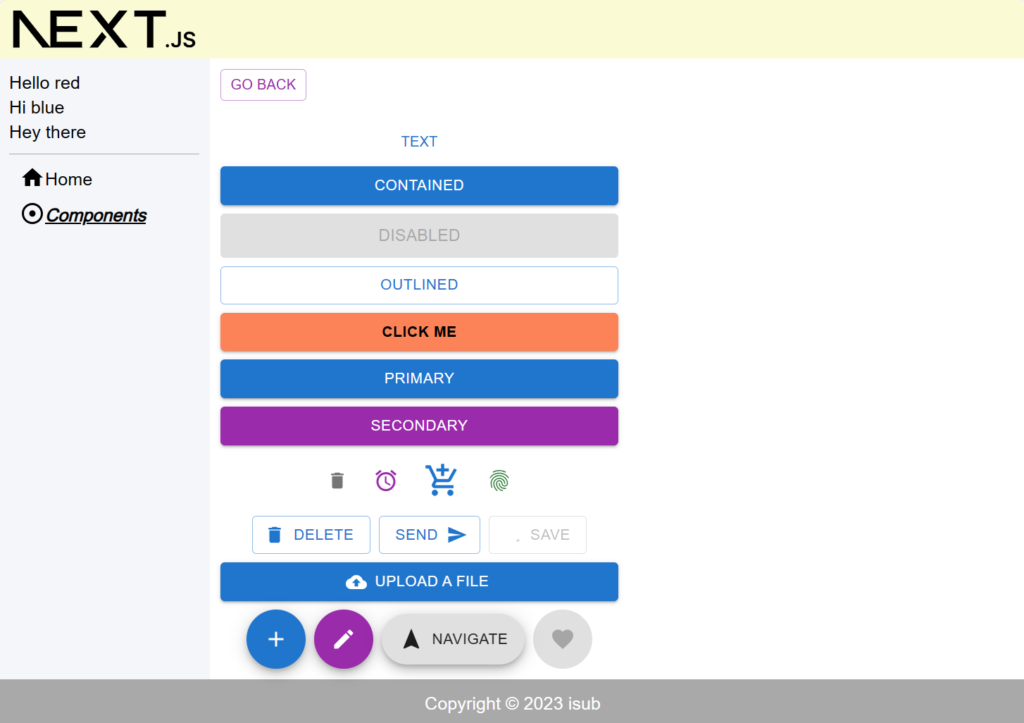
前回はSnackbarやLinkの使い方についてでした。今回はMaterial UIのButton・IconButton・LoadingButton・FAB(Floating Action Button)を扱う内容となります。
対象としては開発を1年程やってて自分で最初から開発してみたい方になります。そのため細かい用語などの説明はしません。
2. nodeのインストール
こちらを参考
3. プロジェクトを作成
こちらを参考
4. 必要なライブラリをインストール
こちらを参考
npm install @mui/lab5. ソースコード
※前回より差分のみを記載
5-1-1. src/lib/utils/util.ts
import { styled } from "@mui/material/styles";

export const getWhichSelected = (
  x: string | null,
  y: string | null,
  selectedClass: string,
  unselectedClass: string
): string => (x === y ? selectedClass : unselectedClass);

export const VisuallyHiddenInput = styled("input")`
  clip: rect(0 0 0 0);
  clip-path: inset(50%);
  height: 1px;
  overflow: hidden;
  position: absolute;
  bottom: 0;
  left: 0;
  white-space: nowrap;
  width: 1px;
`;
5-1-2. src/app/components/component02/page.module.scss
.component {
  color: blue;
}
5-1-3. src/app/components/component02/page.tsx
"use client";

import React from "react";

import scss from "./page.module.scss";
import GoBack from "@/lib/components/go-back";
import { Button, IconButton, Stack } from "@mui/material";
import DeleteIcon from "@mui/icons-material/Delete";
import SendIcon from "@mui/icons-material/Send";
import AlarmIcon from "@mui/icons-material/Alarm";
import AddShoppingCartIcon from "@mui/icons-material/AddShoppingCart";
import Fingerprint from "@mui/icons-material/Fingerprint";
import CloudUploadIcon from "@mui/icons-material/CloudUpload";
import LoadingButton from "@mui/lab/LoadingButton";
import SaveIcon from "@mui/icons-material/Save";
import Fab from "@mui/material/Fab";
import AddIcon from "@mui/icons-material/Add";
import EditIcon from "@mui/icons-material/Edit";
import FavoriteIcon from "@mui/icons-material/Favorite";
import NavigationIcon from "@mui/icons-material/Navigation";
import { VisuallyHiddenInput } from "@/lib/utils/util";

const Component02 = () => {
  return (
    <div className={scss.component}>
      <GoBack />
      <br />
      <br />
      <Stack spacing={1} sx={{ width: "50%" }}>
        <Button variant="text" size="small">
          Text
        </Button>
        <Button variant="contained" size="medium">
          Contained
        </Button>
        <Button variant="contained" disabled size="large">
          Disabled
        </Button>
        <Button variant="outlined">Outlined</Button>
        <Button
          variant="contained"
          sx={{
            backgroundColor: "coral",
            color: "black",
            fontWeight: "bold",
            ":hover": { backgroundColor: "red", color: "white" },
          }}
          onClick={() => {
            alert("clicked");
          }}
        >
          Click me
        </Button>
        <Button variant="contained" color="primary">
          Primary
        </Button>
        <Button variant="contained" color="secondary">
          Secondary
        </Button>
        <Stack
          direction="row"
          spacing={1}
          justifyContent="center"
          alignItems="center"
        >
          <IconButton aria-label="delete">
            <DeleteIcon fontSize="small" />
          </IconButton>
          <IconButton color="secondary" aria-label="add an alarm">
            <AlarmIcon fontSize="medium" />
          </IconButton>
          <IconButton color="primary" aria-label="add to shopping cart">
            <AddShoppingCartIcon fontSize="large" />
          </IconButton>
          <IconButton color="success" aria-label="fingerprint">
            <Fingerprint fontSize="inherit" />
          </IconButton>
        </Stack>
        <Stack
          direction="row"
          spacing={1}
          justifyContent="center"
          alignItems="center"
        >
          <Button variant="outlined" startIcon={<DeleteIcon />}>
            Delete
          </Button>
          <Button variant="outlined" endIcon={<SendIcon />}>
            Send
          </Button>
          <LoadingButton
            loading
            loadingPosition="start"
            startIcon={<SaveIcon />}
            variant="outlined"
          >
            Save
          </LoadingButton>
        </Stack>
        <Button
          component="label"
          variant="contained"
          startIcon={<CloudUploadIcon />}
          href="#file-upload"
        >
          Upload a file
          <VisuallyHiddenInput type="file" />
        </Button>
        <Stack
          direction="row"
          spacing={1}
          justifyContent="center"
          alignItems="center"
        >
          <Fab color="primary" aria-label="add">
            <AddIcon />
          </Fab>
          <Fab color="secondary" aria-label="edit">
            <EditIcon />
          </Fab>
          <Fab variant="extended">
            <NavigationIcon sx={{ mr: 1 }} />
            Navigate
          </Fab>
          <Fab disabled aria-label="like">
            <FavoriteIcon />
          </Fab>
        </Stack>
      </Stack>
    </div>
  );
};

export default Component02;
5-1-4. src/app/components/page.tsx
"use client";

import React from "react";
import { Link } from "@mui/material";

import scss from "./page.module.scss";

const Components = () => {
  return (
    <div className={scss.components}>
      <ul>
        <li>
          <Link href="/components/component01" underline="hover">
            Component01
          </Link>
        </li>
        <li>
          <Link href="/components/component02" underline="hover">
            Component02
          </Link>
        </li>
      </ul>
    </div>
  );
};

export default Components;
6. サーバーを起動
npm run dev7. ブラウザで確認
- http://localhost:3000
8. ディレクトリの構造
.
├── README.md
├── next-env.d.ts
├── next.config.js
├── package-lock.json
├── package.json
├── postcss.config.js
├── public
│   ├── next.svg
│   └── vercel.svg
├── src
│   ├── app
│   │   ├── components
│   │   │   ├── component01
│   │   │   │   ├── page.module.scss
│   │   │   │   └── page.tsx
│   │   │   ├── component02
│   │   │   │   ├── page.module.scss
│   │   │   │   └── page.tsx
│   │   │   ├── page.module.scss
│   │   │   └── page.tsx
│   │   ├── favicon.ico
│   │   ├── globals.css
│   │   ├── globals.scss
│   │   ├── layout.module.scss
│   │   ├── layout.tsx
│   │   ├── page.module.scss
│   │   └── page.tsx
│   ├── lib
│   │   ├── common
│   │   │   ├── definitions.ts
│   │   │   └── sidebar-links.tsx
│   │   ├── components
│   │   │   ├── alert-snackbar.tsx
│   │   │   └── go-back.tsx
│   │   ├── footer.tsx
│   │   ├── header.tsx
│   │   ├── sidebar.tsx
│   │   └── utils
│   │       └── util.ts
│   └── scss
│       └── common
│           ├── _index.scss
│           ├── _mixin.scss
│           ├── _mq.scss
│           └── _variables.scss
├── tailwind.config.ts
└── tsconfig.json

12 directories, 35 files
9. 備考
今回はMaterial UIのButton・IconButton・LoadingButton・FAB(Floating Action Button)を扱う内容でした。
10. 参考
投稿者プロフィール
-
開発好きなシステムエンジニアです。
卓球にハマってます。


