


1. 概要
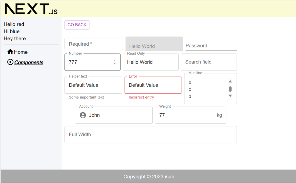
前回はButton・IconButton・LoadingButton・FAB(Floating Action Button)の使い方についてでした。今回はTextFieldを扱う内容となります。
対象としては開発を1年程やってて自分で最初から開発してみたい方になります。そのため細かい用語などの説明はしません。
2. nodeのインストール
こちらを参考
3. プロジェクトを作成
こちらを参考
4. 必要なライブラリをインストール
こちらを参考
5. ソースコード
※前回より差分のみを記載
5-1-1. src/app/components/component03/page.module.scss
.component {
  color: blue;
}
5-1-2. src/app/components/component03/page.tsx
"use client";

import React from "react";
import { Stack } from "@mui/material";
import TextField from "@mui/material/TextField";
import InputAdornment from "@mui/material/InputAdornment";
import AccountCircle from "@mui/icons-material/AccountCircle";
import scss from "./page.module.scss";
import GoBack from "@/lib/components/go-back";

const Component03 = () => {
  return (
    <div className={scss.component}>
      <GoBack />
      <br />
      <br />
      <Stack spacing={1} sx={{ width: "75%" }}>
        <Stack
          direction="row"
          spacing={1}
          justifyContent="center"
          alignItems="center"
        >
          <TextField
            required
            label="Required"
            variant="outlined"
            size="small"
          />
          <TextField
            disabled
            variant="filled"
            defaultValue="Hello World"
            size="small"
          />
          <TextField
            label="Password"
            type="password"
            variant="standard"
            autoComplete="current-password"
            size="small"
          />
        </Stack>
        <Stack
          direction="row"
          spacing={1}
          justifyContent="center"
          alignItems="center"
        >
          <TextField
            label="Number"
            type="number"
            InputLabelProps={{ shrink: true }}
          />
          <TextField
            label="Read Only"
            defaultValue="Hello World"
            InputProps={{ readOnly: true }}
          />
          <TextField label="Search field" type="search" />
        </Stack>
        <Stack
          direction="row"
          spacing={1}
          justifyContent="center"
          alignItems="center"
        >
          <TextField
            label="Helper text"
            defaultValue="Default Value"
            helperText="Some important text"
          />
          <TextField
            error
            label="Error"
            defaultValue="Default Value"
            helperText="Incorrect entry"
          />
          <TextField
            multiline
            rows={3}
            label="Multiline"
            placeholder="Placeholder"
          />
        </Stack>
        <Stack
          direction="row"
          spacing={1}
          justifyContent="center"
          alignItems="center"
        >
          <TextField
            label="Account"
            variant="outlined"
            InputProps={{
              startAdornment: (
                <InputAdornment position="start">
                  <AccountCircle />
                </InputAdornment>
              ),
            }}
          />
          <TextField
            label="Weight"
            sx={{ m: 1, width: "25ch" }}
            InputProps={{
              endAdornment: <InputAdornment position="end">kg</InputAdornment>,
            }}
          />
        </Stack>
        <Stack
          direction="row"
          spacing={1}
          justifyContent="center"
          alignItems="center"
        >
          <TextField fullWidth label="Full Width" color="secondary" />
        </Stack>
      </Stack>
    </div>
  );
};

export default Component03;
5-1-3. src/app/components/page.tsx
"use client";

import React from "react";
import { Link } from "@mui/material";

import scss from "./page.module.scss";

const Components = () => {
  return (
    <div className={scss.components}>
      <ul>
        <li>
          <Link href="/components/component01" underline="hover">
            Component01
          </Link>
        </li>
        <li>
          <Link href="/components/component02" underline="hover">
            Component02
          </Link>
        </li>
        <li>
          <Link href="/components/component03" underline="hover">
            Component03
          </Link>
        </li>
      </ul>
    </div>
  );
};

export default Components;
6. サーバーを起動
npm run dev7. ブラウザで確認
- http://localhost:3000
8. ディレクトリの構造
.
├── README.md
├── next-env.d.ts
├── next.config.js
├── package-lock.json
├── package.json
├── postcss.config.js
├── public
│   ├── next.svg
│   └── vercel.svg
├── src
│   ├── app
│   │   ├── components
│   │   │   ├── component01
│   │   │   │   ├── page.module.scss
│   │   │   │   └── page.tsx
│   │   │   ├── component02
│   │   │   │   ├── page.module.scss
│   │   │   │   └── page.tsx
│   │   │   ├── component03
│   │   │   │   ├── page.module.scss
│   │   │   │   └── page.tsx
│   │   │   ├── page.module.scss
│   │   │   └── page.tsx
│   │   ├── favicon.ico
│   │   ├── globals.css
│   │   ├── globals.scss
│   │   ├── layout.module.scss
│   │   ├── layout.tsx
│   │   ├── page.module.scss
│   │   └── page.tsx
│   ├── lib
│   │   ├── common
│   │   │   ├── definitions.ts
│   │   │   └── sidebar-links.tsx
│   │   ├── components
│   │   │   ├── alert-snackbar.tsx
│   │   │   └── go-back.tsx
│   │   ├── footer.tsx
│   │   ├── header.tsx
│   │   ├── sidebar.tsx
│   │   └── utils
│   │       └── util.ts
│   └── scss
│       └── common
│           ├── _index.scss
│           ├── _mixin.scss
│           ├── _mq.scss
│           └── _variables.scss
├── tailwind.config.ts
└── tsconfig.json

13 directories, 37 files
9. 備考
今回はMaterial UIのTextFieldを扱う内容でした。
10. 参考
投稿者プロフィール
-
開発好きなシステムエンジニアです。
卓球にハマってます。


